GreenShield
About GreenShield
GreenShield Canada (GSC) is a comprehensive healthcare payer-provider that merges insurance benefits with healthcare providers. With the goal of streamlining your health experience, GSC has acquired numerous health service providers and seamlessly integrated them into a groundbreaking, integrated solution called GreenShield Plus.
Role & Deliverables
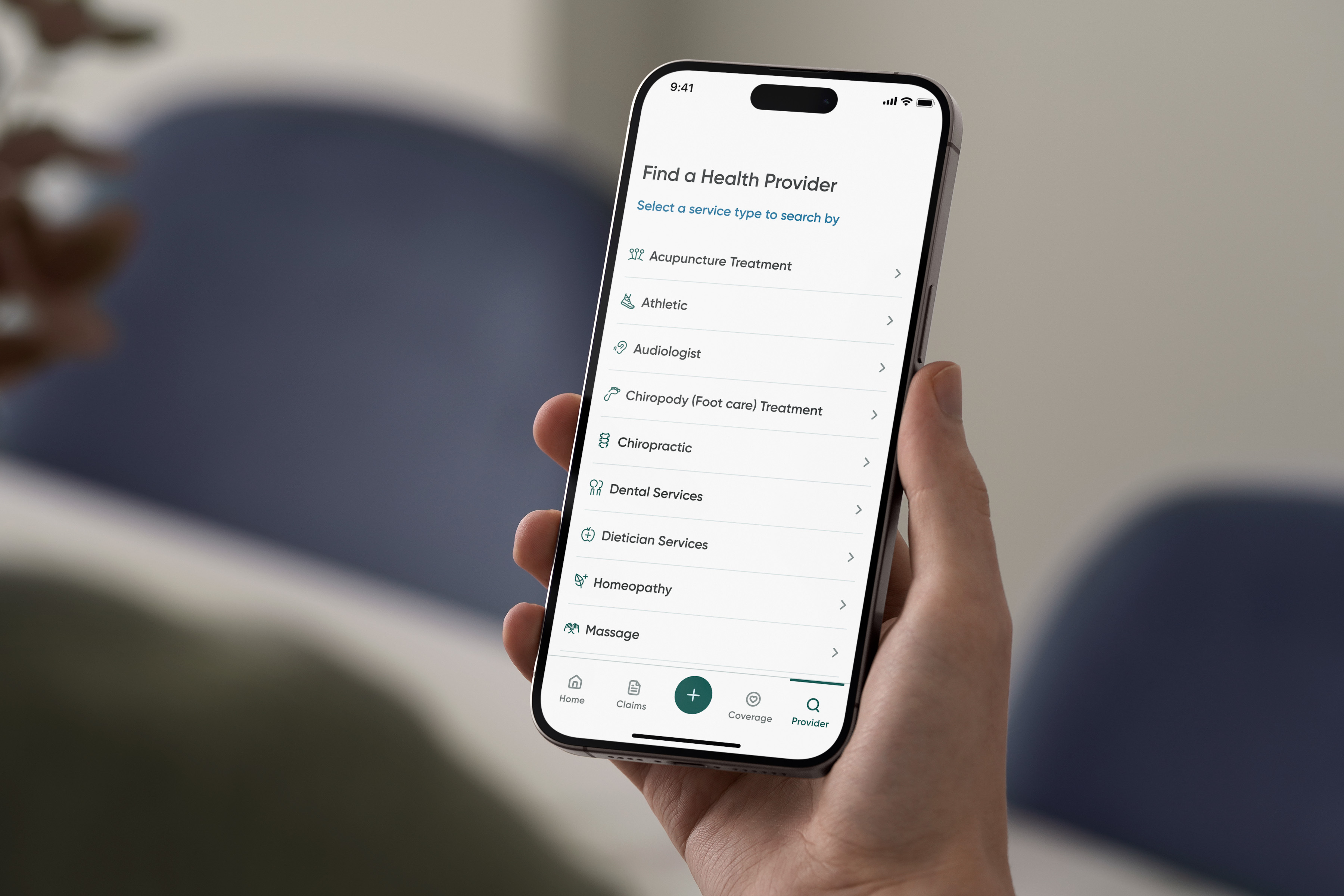
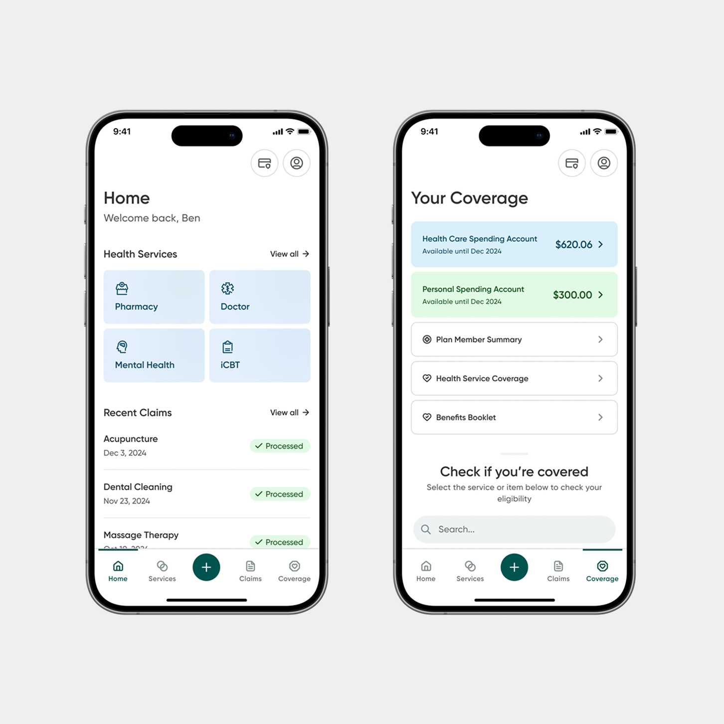
At the start of this initiative, GreenShield had acquired a variety of healthcare products — including therapy, telemedicine, and digital pharmacy — with the goal of merging them into a cohesive, all-in-one healthcare platform. I led the initiative of creating GreenShield’s Design System to support this transition, providing a scalable foundation that unified both web and mobile products under a consistent design language.
The system was built to align diverse teams and products, ensuring visual consistency, development efficiency, and a shared set of principles. Alongside this, I supported the Super App initiative, collaborating with designers across teams to ensure consistency in structure, interaction patterns, and component usage throughout the ecosystem.
- Research and audit of existing GreenShield and acquired product experiences.
- Creation of a unified Design System for web and mobile.
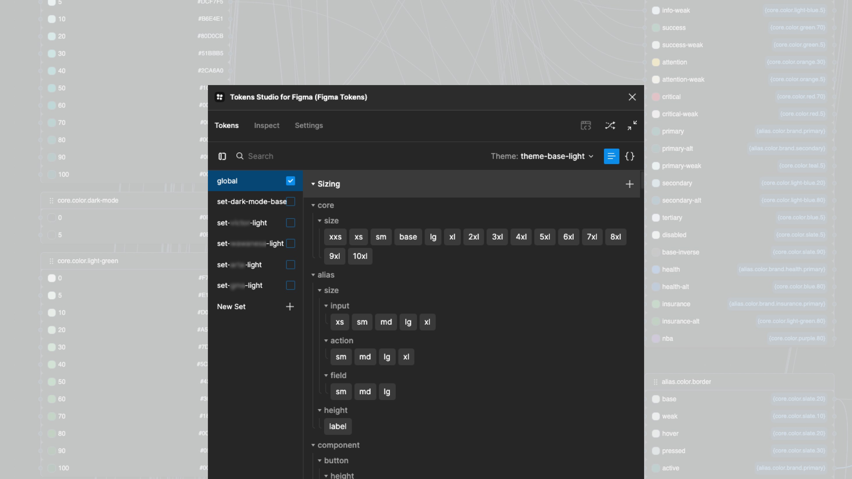
- Custom design token system built in Token Studio.
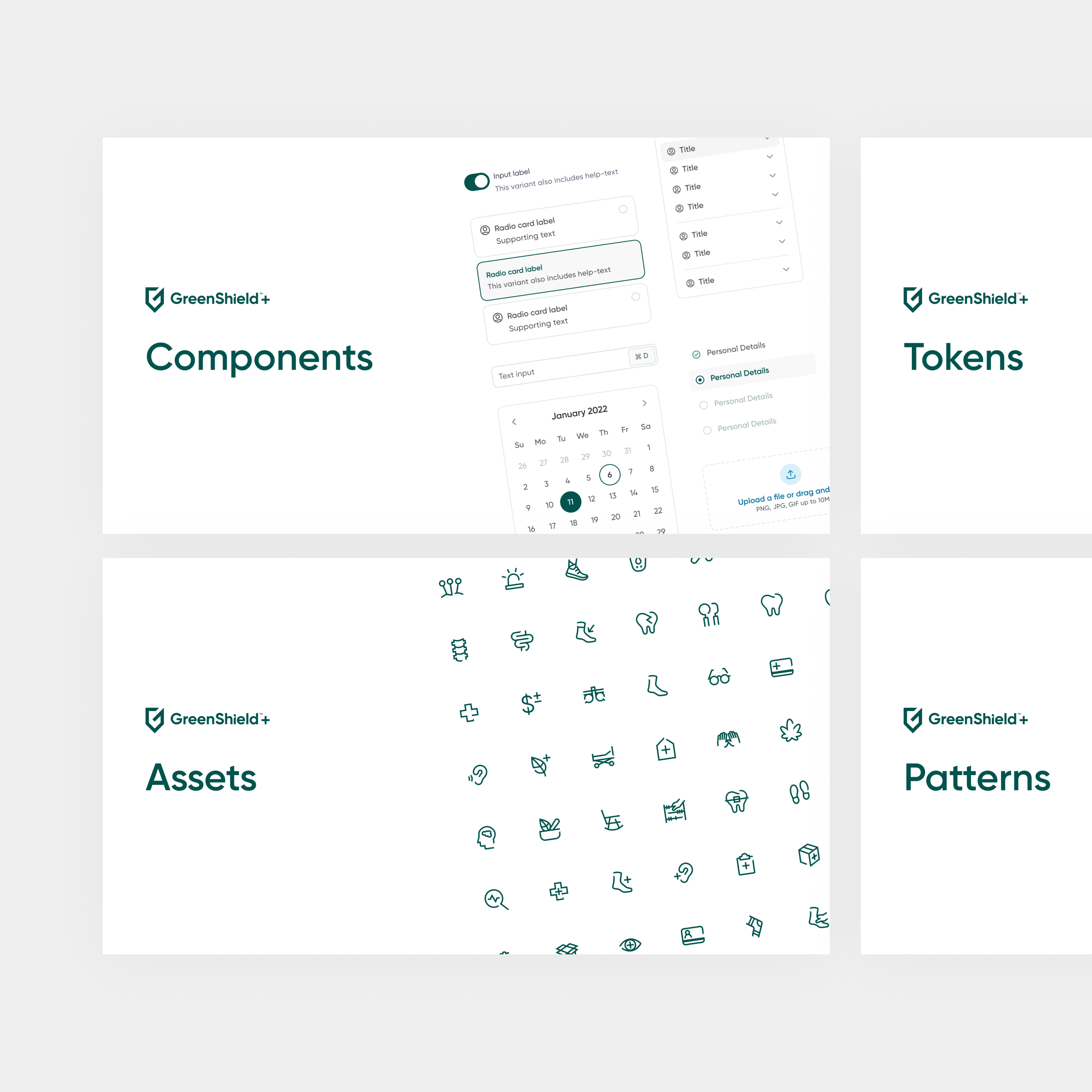
- Structured Figma files for Components, Tokens, Assets, and Patterns.
- Robust system documentation using Supernova
- Collaboration with developers to establish implementation standards.
- Ongoing support for the GreenShield Super App team, ensuring cross-product consistency.
- Design guidelines and principles to maintain scalability across brands and white-labeled clients.
Date
Services
Design System Foundations
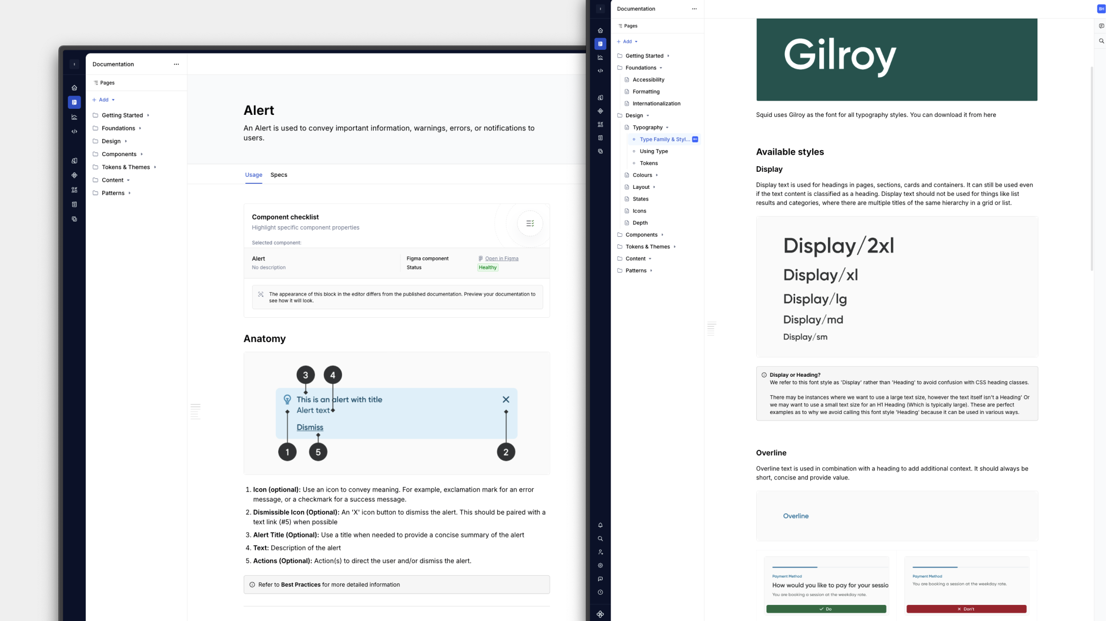
To lay the groundwork for GreenShield’s design system, I began by researching and auditing established systems like Material, Apple’s Human Interface Guidelines, Atlassian, and Shopify Polaris. This helped define the structure, governance model, and level of flexibility GreenShield’s system would need to support both web and mobile products. I also explored the best tools and workflows for cross-team collaboration, landing on a Figma-first approach paired with Token Studio and Supernova for token management and documentation.
Once the foundation was set, I created a comprehensive multi-level token system. Collaboration with developers was essential - we worked closely to align on naming conventions, token formats, and component implementation standards. This process established the foundation for a scalable design-to-code workflow, ensuring the system could evolve alongside GreenShield’s expanding ecosystem of healthcare products.

Component Architecture & Flexibility
With the foundations in place, the next challenge was designing components that could flex to meet the needs of multiple products – from therapy and telemedicine to pharmacy and wellness – without sacrificing visual consistency. I approached this by focusing on modularity and configurability, designing components that could adapt to different use cases while maintaining a shared structure and interaction model.
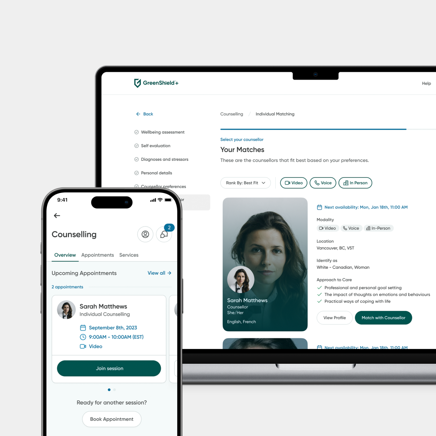
Guided by the principle “make the common configurable, and the uncommon composable” (heard from Nathan Curtis, Schema, 2023) each component was built to balance standardization with creative flexibility. Components were designed with clear variants, slots, and substitution areas, enabling teams to create diverse experiences without detaching from the system.
I also introduced reusable patterns for common workflows, ensuring a consistent yet flexible foundation across GreenShield’s suite of web and mobile products.
Documentation & Adoption
A design system is only as strong as its adoption, so a key focus was ensuring teams could easily understand, use, and contribute to it. I built comprehensive documentation in Supernova, covering everything from foundational tokens to component usage, accessibility guidelines, and interaction principles. Each section was paired with visual examples and best practices, helping designers and developers quickly find what they needed.
To support adoption, I worked closely with cross-functional teams – introducing the system through guided walkthroughs, design critiques, and ongoing support. As new products were integrated into the GreenShield ecosystem, I helped teams map their existing components to system equivalents, reducing fragmentation and reinforcing a shared language of design. Over time, this documentation and collaboration process turned the design system into more than just a toolkit – it became a central resource that connected teams and elevated the quality and consistency of every product.