Hapbee
About Hapbee
Hapbee is a wearable wellness company that uses ultra-low radio frequency energy (ulRFE) to safely reproduce the magnetic signatures of compounds like caffeine or melatonin, allowing users to “feel” their desired state on demand. It’s an ambitious product blending science, wellness, and technology into one seamless experience.
Role & Deliverables
I joined Hapbee to redesign their companion app, giving it a clearer and more cohesive identity. I developed a new visual language for their core experiences while rethinking the overall UX architecture. My focus was on improving key flows such as onboarding, device setup, and daily use to create a more intuitive and emotionally engaging experience.
- Led digital product design, collaborating closely with engineering and executives.
- Redesign of Hapbee’s companion mobile app.
- Designed the tablet app for the in-spa and hotel experience.
- New in-app visual system for Categories, Playables, and Playlists.
- Mobile/Tablet Component Library.
Date
Services
Device Management
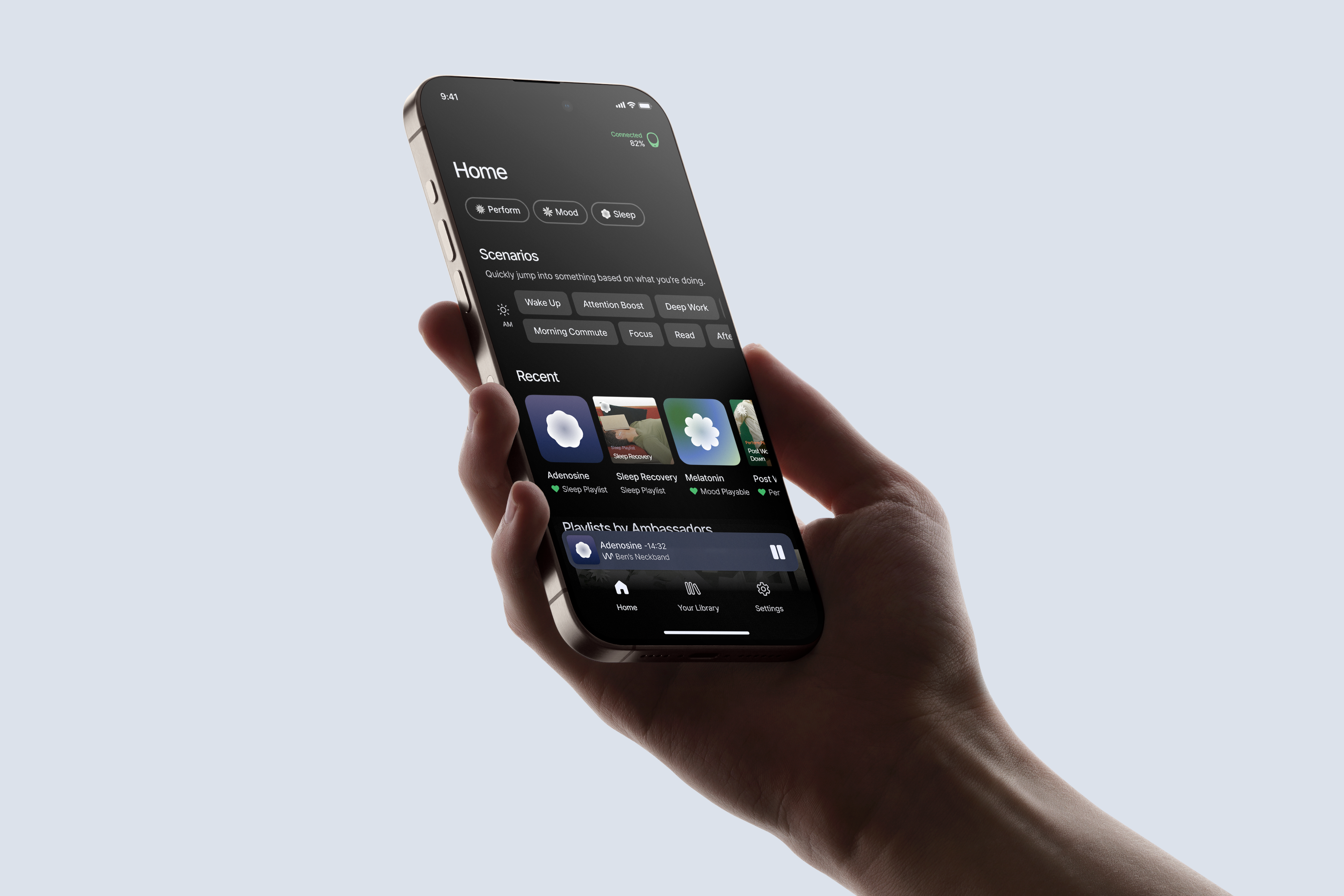
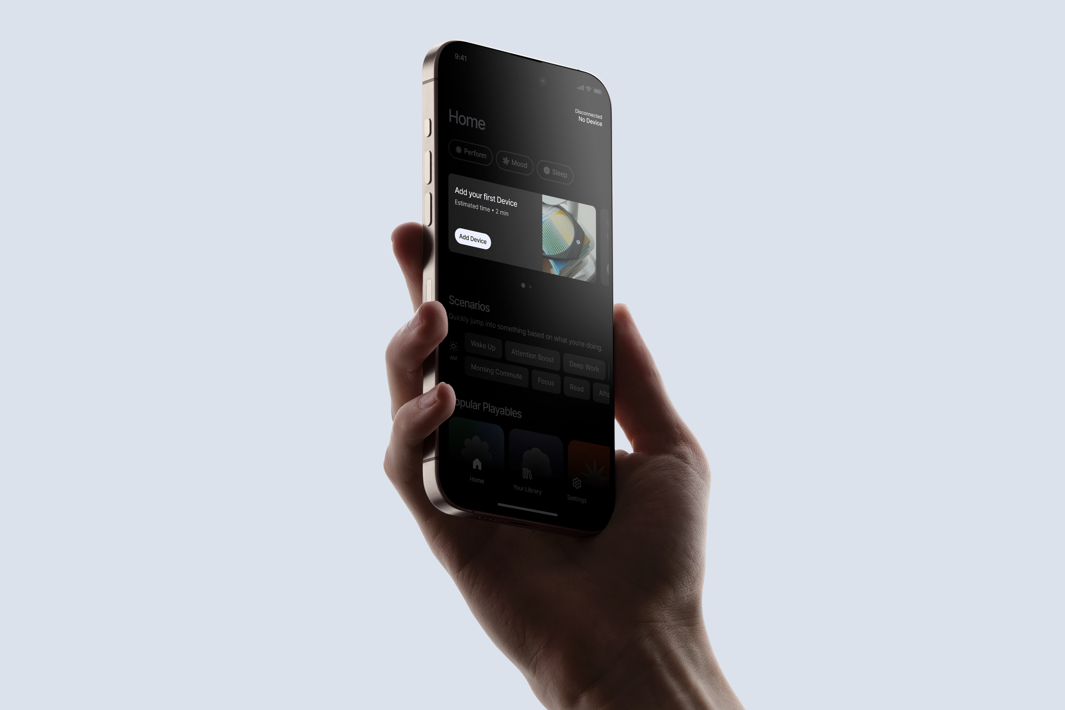
Device management is a core part of the experience, yet the original flow lacked clarity and feedback. I introducing hierarchy and structure to the various ways a user could add a new device — making the setup process more simplified and intuitive, guiding users seamlessly from pairing to connection.

To make device states easier to understand at a glance, I introduced clear status indicators for connected, available, and unavailable devices. I also incorporated subtle haptics and visual feedback for status changes, creating a more tactile and responsive experience. Together, these improvements made device management feel more reliable, understandable, and human.


Visual Language
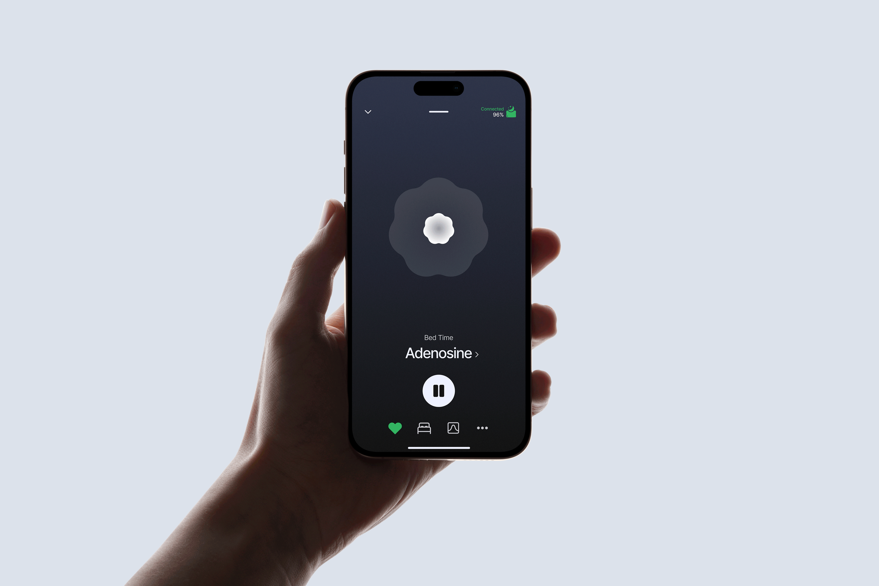
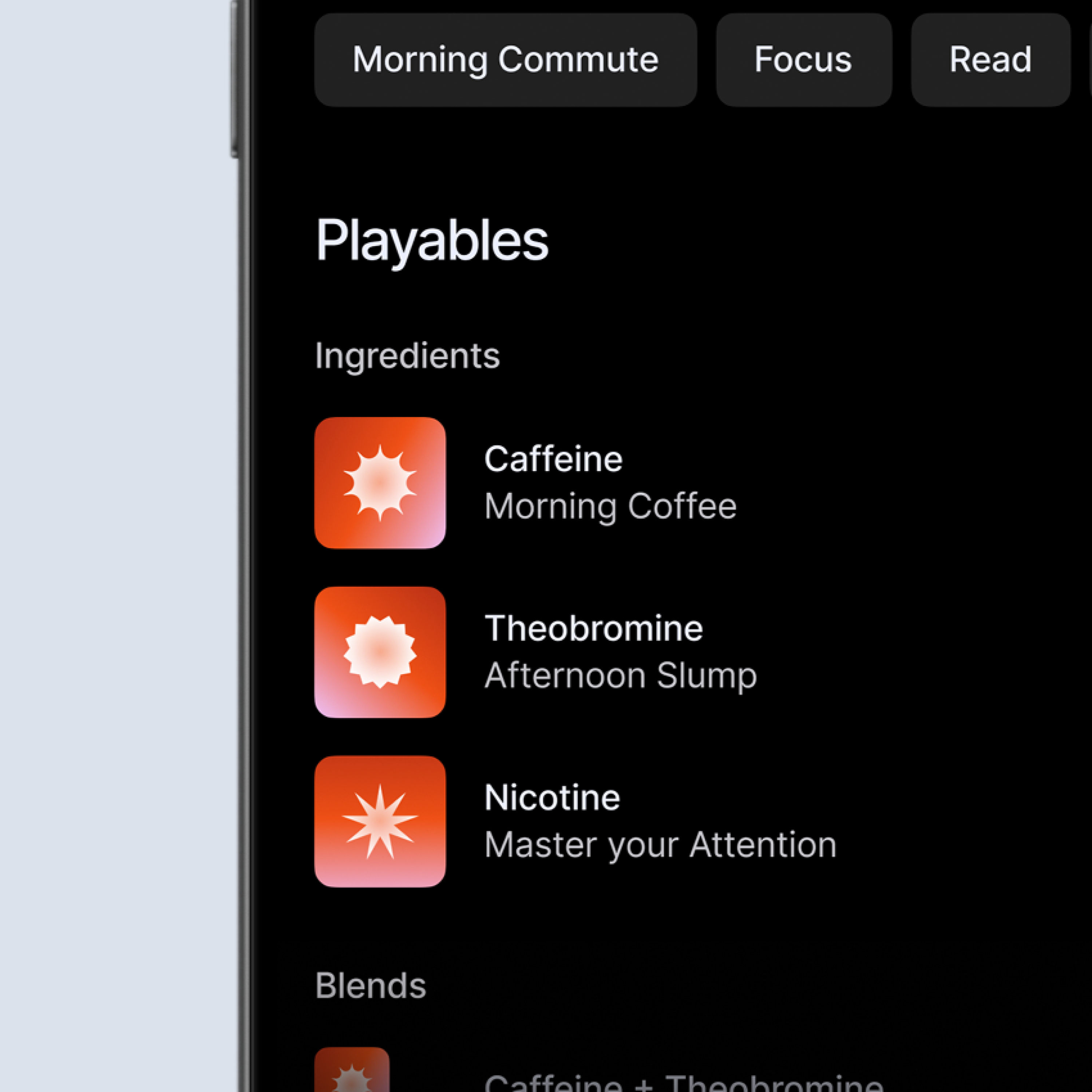
To bring cohesion and recognizability to Hapbee’s content, I developed a new visual system built around three principle shapes and color palettes — representing Mood, Performance, and Sleep. Each shape carried its own design motifs that guided the visual identity of the compounds within that category. From there, I created individual compound shapes that retained the same structural motifs, ensuring consistency while allowing for unique expression.
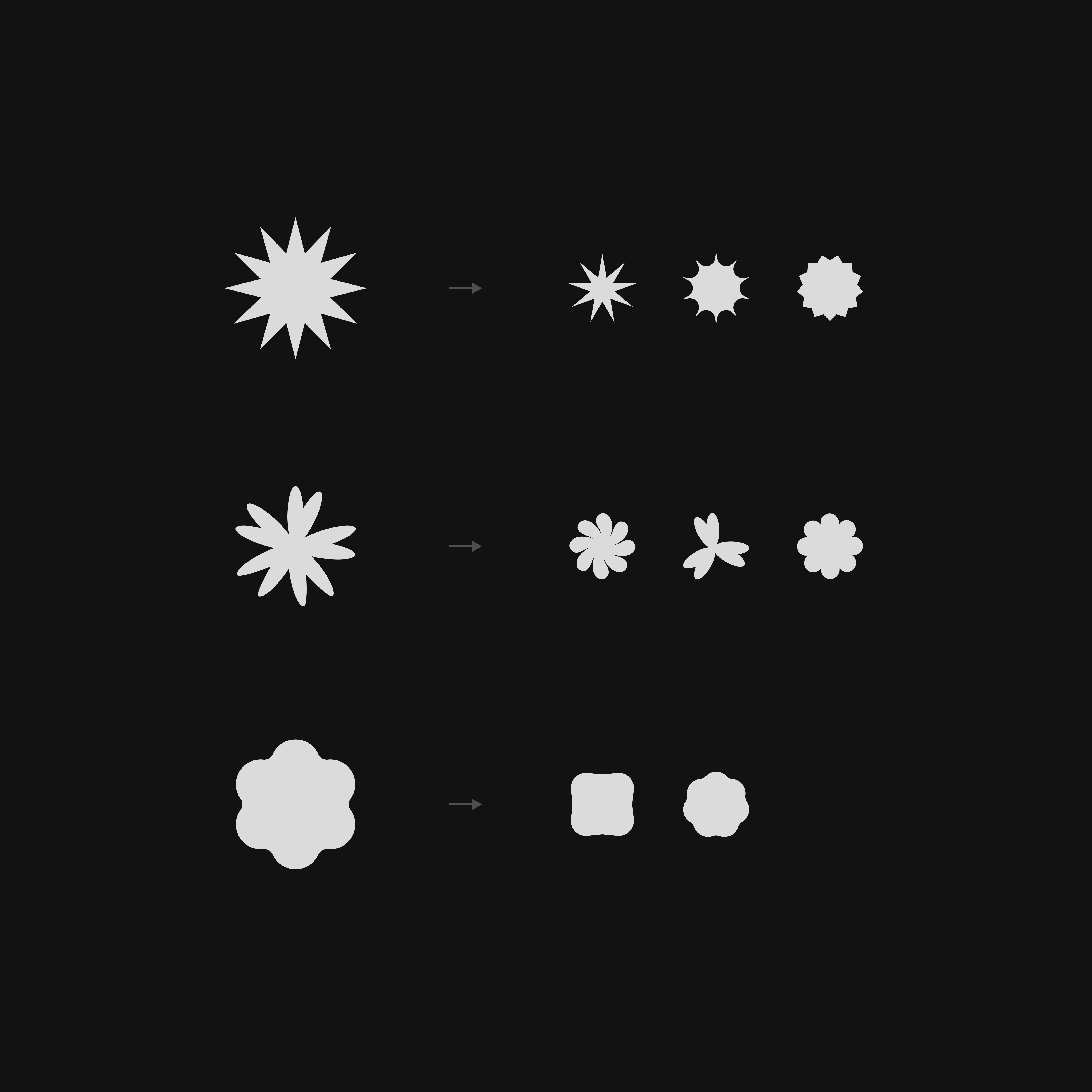
Rather than relying on literal imagery, like a coffee mug for caffeine, I chose to create abstract representations for each compound. This approach reflected the multi-benefit nature of many signals while keeping the visuals modern and versatile. Ultimately, these shapes weren’t meant to explain what a compound does, but to help users quickly identify its category and enjoy a more cohesive, decorative layer to the interface.
For Playlists, I reworked the cards and photography to feel more modern and consistent with the new direction. The existing photos felt dated and lacked cohesion, and with no resources for a full photoshoot, I curated stock imagery that conveyed a refined and emotionally resonant aesthetic.

User Onboarding
The onboarding experience was redesigned to get users using their device as quickly as possible, while also educating them on key terms and features so they could confidently navigate the app.

Previously, users often entered the app without a clear sense of what to do next. I introducing simple, action-oriented guidance that helped them get started right away — from pairing their device to trying their first Playable. This gave users direction, reduced early friction, and made the first moments with the product feel intentional and encouraging.