Inkblot
About Inkblot
Inkblot Therapy is a mental health platform offering virtual therapy, coaching, and wellness services for individuals and employees. On the other side of the platform, therapists can join Inkblot to manage their practice and be matched with new clients through the platform’s network.
Role & Deliverables
I led the rebrand and redesign of Inkblot’s marketing website, working closely with the marketing team and executives to align on brand direction, messaging, and strategy. As the sole designer, I established the new visual identity, defined the site architecture, and designed the entire experience from concept to launch — collaborating directly with a Webflow developer to bring it to life within a three-month timeline.
- Brand audit and rebrand for Inkblot
- Definition of visual identity, typography, and color system
- Design of the new Inkblot marketing website
- Information architecture and content strategy
- Delivery of responsive web designs and design documentation
Date
Services

Brand Direction
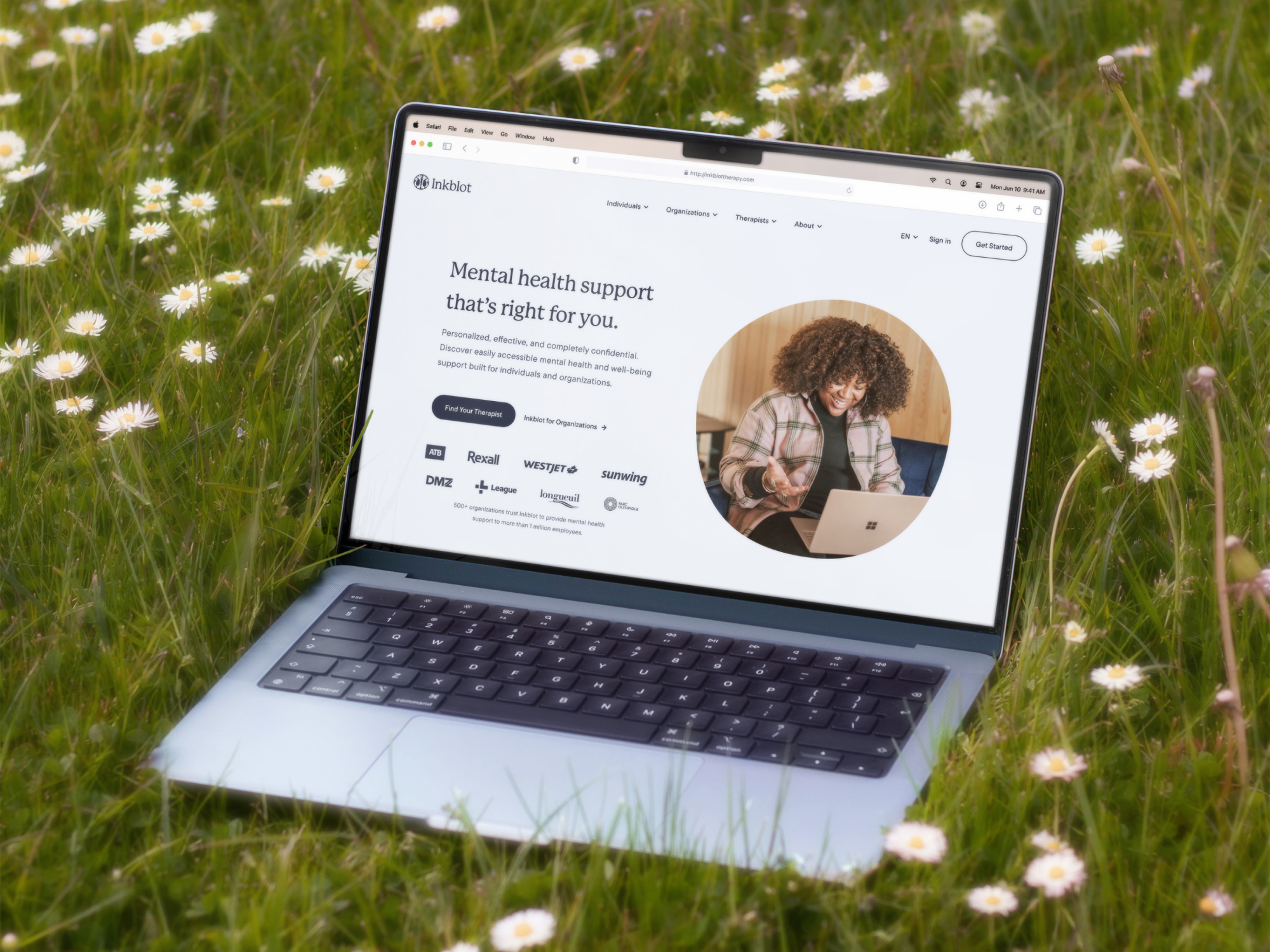
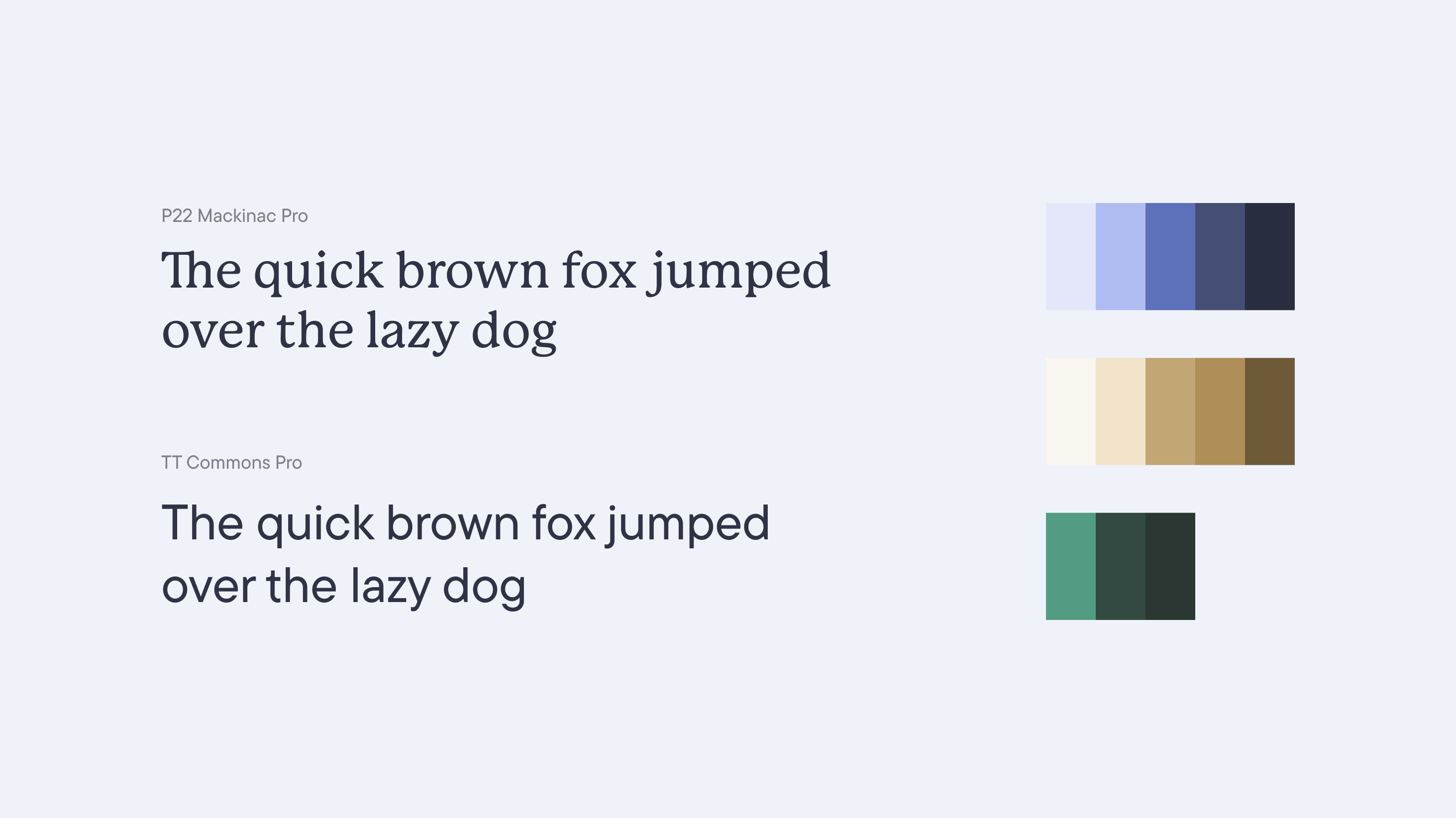
The previous brand and website felt more like a software product than a mental health platform centered on people. My goal was to shift the focus toward warmth and connection - creating a brand that felt light, welcoming, and organic, while still communicating trust and credibility. I introduced an earth-toned color palette with three distinct colors to represent the platform’s audiences: Individuals, Therapists, and Organizations. Organic shapes were layered throughout the design to bring softness and flow, while a serif typeface was introduced for headings to add a more human and approachable tone.
To bring more personality to the brand, I collaborated with fellow designer Ris Wong, whose illustration style perfectly complemented the new direction. We introduced illustrations primarily across the Individuals and Therapists pages to evoke empathy and approachability, while keeping the Organizations pages slightly more structured and professional to balance business needs with emotional tone.

Individuals
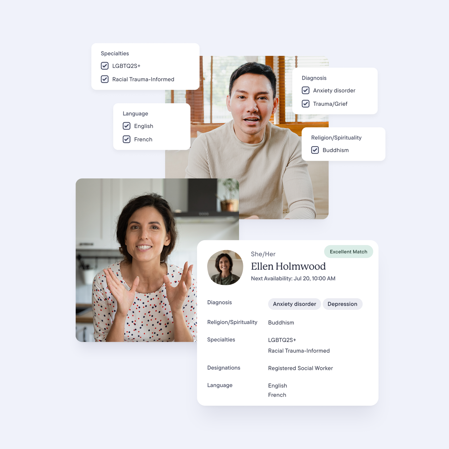
The Individuals pages were designed to make therapy feel approachable and personalized. My focus was on communicating that Inkblot offers a wide range of options - highlighting the diversity of filters and preferences within the matching process to show that there’s a therapist suited for everyone’s needs. I also emphasized how simple it is to get started, introducing a clear five-step breakdown of the matching process to make it feel easy and stress-free.
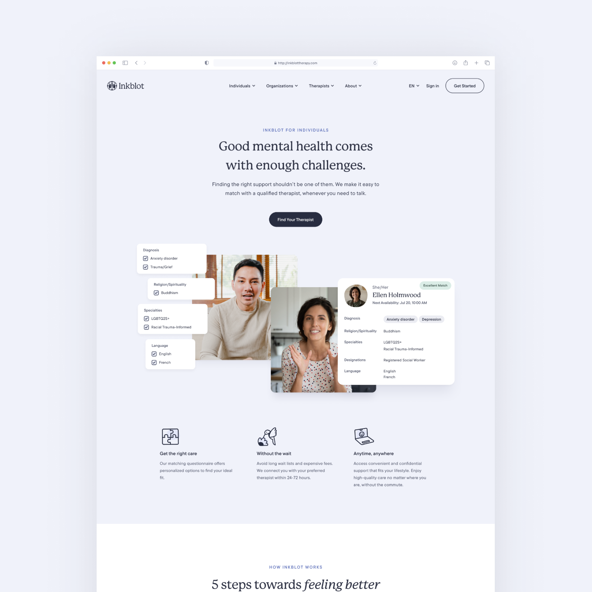
Visually, I combined elements from the platform with custom illustrations to shift the focus away from the tool itself and toward the overall process and outcomes - feeling supported, finding the right match, and taking the first step toward better mental health. The result was a page that balanced warmth and clarity, guiding users from curiosity to confidence.

Therapists and Organizations
For the Therapists pages, the goal was to showcase the scale and diversity of Inkblot’s network while making the experience feel personal and community-driven. This was established right in the hero section through a collage of therapist portraits layered with organic, pebble-like shapes - a visual nod to connection and individuality within the network. I also highlighted the key features of the platform, using imagery and iconography to represent tools for managing clients and sessions. Ideally, this section would have included product mockups, but with the practitioner platform not yet redesigned, I focused on communicating value and capability through visuals that still felt cohesive and trustworthy.

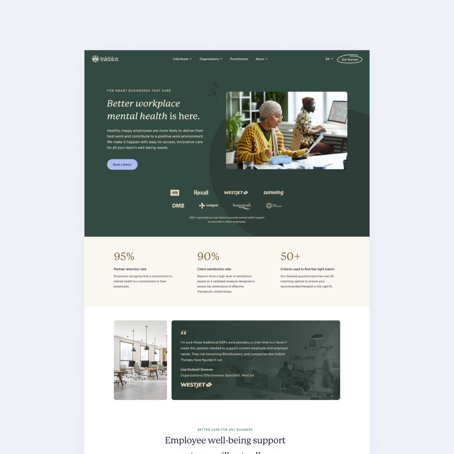
The Organizations pages focused on Inkblot’s data-driven impact and the breadth of its service offerings. Here, the goal was to highlight measurable outcomes, key clients, and the spectrum of care available to employees - reinforcing Inkblot’s position as a trusted partner in workplace wellness.